
Conference Badge Templates for Attendees, Speakers, Exhibitors and VIPs
A good conference badge template makes the attendee’s name easy to read, keeps role information obvious and leaves enough room for branding or scannable codes without turning the badge into a miniature poster.
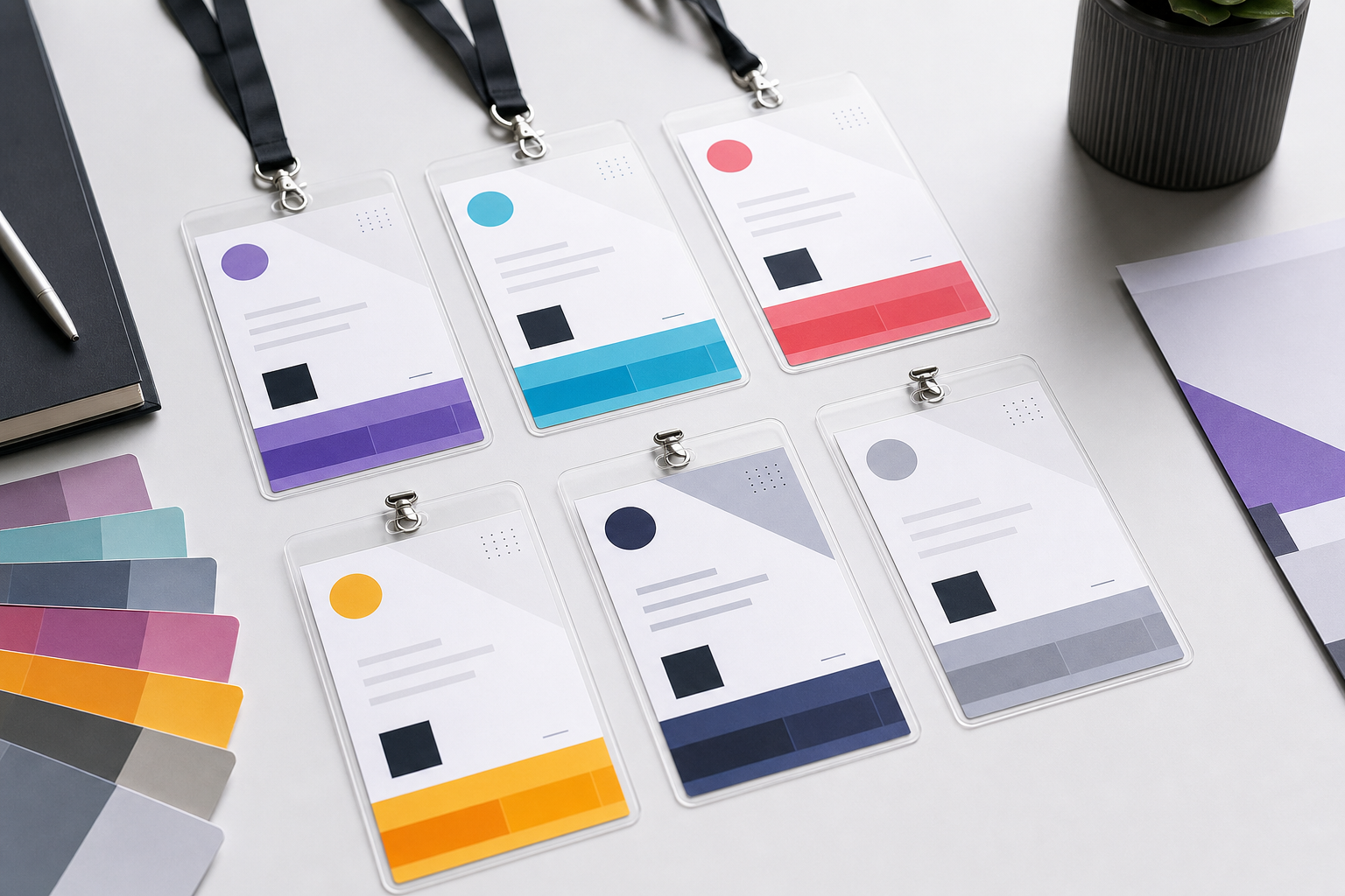
- Information hierarchy
- Templates by participant type
- Colour and accessibility
- Size and orientation
- Long names and missing data
- One spreadsheet, multiple badge types
The short answer: design for recognition first
A conference badge is successful when another attendee can identify the wearer quickly from a natural networking distance. The attendee’s name should therefore dominate. Organisation, role and badge category support the introduction. Logos, sponsor marks and decorative elements come after those jobs are solved.
BadgeFlow lets you begin with a template or build your own layout, map spreadsheet columns to badge fields, add logos, QR codes and barcodes, and export a print-ready PDF. The design guidance below applies whether you print in-house or send the PDF to a print provider.
Use a clear information hierarchy
| Priority | Typical content | Design treatment |
|---|---|---|
| 1 | Attendee name | Largest type, high contrast, generous space. |
| 2 | Organisation or role | Smaller but still readable; avoid low-contrast grey. |
| 3 | Badge type | Strong label, band or shape; do not rely on colour alone. |
| 4 | QR code or barcode | Clear quiet area, away from folds, clips and seams. |
| 5 | Brand and sponsors | Consistent and restrained so they do not compete with the name. |
For broader design principles, read how to design conference name badges.
Attendee badge template
The attendee template should be the simplest and most flexible design in the system. A strong default includes:
- First and last name in large type
- Organisation or community
- Optional job title
- A clearly labelled attendee category
- Optional QR code or registration ID
Do not fill every available centimetre. White space helps a badge remain readable while accommodating names that are longer than the sample data used during design.
Speaker badge template
Speakers need to be recognisable to attendees, room managers and production staff. Keep the same basic structure as the attendee badge, then add a highly visible “Speaker” label. If the event runs several tracks, a small track name can be useful, but avoid adding a full session schedule to the front.
A portrait 4 × 6 inch format can accommodate a speaker photograph, but a photo is not mandatory. The name still needs to remain the most readable element.
Exhibitor badge template
Exhibitor badges often need a company name, booth number and staff member name. The company should not overpower the person: networking still works better when the individual’s name is easy to read.
- Use the badge-type label “Exhibitor”.
- Add a booth number only when it is operationally useful.
- Keep sponsor tier separate from personal role.
- Use a code only when a compatible lead-retrieval or access system exists.
Sponsor badge template
A sponsor badge can acknowledge the relationship without becoming an advertisement. Use the event’s shared design, add “Sponsor” or a tier label, and keep the wearer’s name prominent. If several employees attend from the same sponsor, avoid placing a huge company logo differently on each badge; consistency makes the set look more professional.
VIP badge template
VIP must be visible to staff but does not need to be visually aggressive. A distinct border, role label or small icon can work better than an entirely different colour palette. When VIP status affects access, ensure venue staff know exactly what the visual treatment means.
Accessibility note Colour should reinforce a role, not be the only way to communicate it. Include a written label such as “VIP”, “Speaker” or “Staff”.
Staff and volunteer badge templates
Staff badges are operational tools. They should be recognisable quickly from a distance and may need a department, function or help label. Useful examples include “Registration”, “Production”, “Accessibility”, “Security” and “Volunteer”.
Consider a different lanyard or a large role band rather than shrinking the person’s name to make room for instructions.
Press and media badge templates
Press badges may need an outlet name, access level and expiration date. Avoid using the word “Press” as a substitute for identity verification. The badge should support the event’s accreditation process, not replace it.
One design or several role-specific designs?
| Approach | Advantages | Risks |
|---|---|---|
| One identical design | Fastest to produce and easiest to maintain. | Roles may be difficult to distinguish. |
| Shared master with role treatments | Consistent brand, clear roles and manageable production. | Requires a tested system for colours, labels or shapes. |
| Completely different templates | Maximum visual distinction. | More design work, more quality-control paths and a less coherent event identity. |
For most conferences, the shared-master approach is the best balance.
Colour-coding badge categories
Choose colours with sufficient contrast and test them on the actual printer and stock. A pale yellow band that looks clear on screen may disappear on an office printer. Always pair colour with text.
- Attendee — neutral event colour
- Speaker — distinctive accent
- Exhibitor — separate accent
- Sponsor — brand-compatible accent
- VIP — high-visibility but restrained
- Staff — easy for attendees to recognise
Landscape or portrait?
Landscape works well when the name and company are the main content and the holder has a top-centred slot. Portrait works well when the badge includes a photograph, a tall sponsor zone, an agenda or a larger code.
Check the holder before finalising the design. A clip, lanyard slot or seam can obscure content. The conference badge dimensions guide and event badge size guide explain the common formats.
Match template complexity to badge size
| Format | Best use | Template guidance |
|---|---|---|
| 4 × 3 in | Name, company, role and compact code | Keep branding restrained and prioritise the name. |
| 4 × 6 in | Large conferences, schedules, sponsor space, bigger codes | Use clear zones so the badge does not become cluttered. |
| A6 | Delegate passes and content-rich conference badges | Works well in portrait with front/back content. |
| A7 | Compact event identification | Limit the number of fields and test long names carefully. |
Where to place names, logos, photos and codes
- Name: central or upper-middle, away from the lanyard clip.
- Organisation: directly beneath the name.
- Role label: top band, bottom band or high-contrast side element.
- Logo: consistent header or footer zone.
- Photo: optional; use only when identification value justifies the space.
- QR or barcode: flat, unobstructed area with adequate surrounding whitespace.
Use the dedicated guide to QR codes on conference badges before placing scannable content.
Design for long names and blank fields
Create test records that are deliberately difficult: a long double surname, a long university name, a blank organisation, a multi-line title and an accented name. Verify that text is not clipped and that optional fields collapse cleanly.
The aim is not to make every badge look pixel-identical. The aim is to keep the information hierarchy consistent despite different data.
Produce all badge types from one spreadsheet
Add columns such as Badge Type, Role Label, Colour Group, Booth and Code Value. Keep the master data in one place, then generate or organise each role group in a controlled sequence.
Start with the large-conference attendee spreadsheet template and the guide to creating name badges from Excel.
Conference badge template checklist
- Make the name readable at networking distance.
- Use text as well as colour for roles.
- Test long names and empty fields.
- Confirm the real holder and insert dimensions.
- Keep codes clear of clips and seams.
- Print a physical test on the final stock.
- Use one consistent master system where possible.
Sample layout recipes
Compact 4 × 3 attendee layout
Use a small event logo at the top, a large two-line name in the centre, organisation beneath it and a narrow role band at the bottom. If a code is required, place a compact QR code in one lower corner and keep the opposite corner visually quiet.
4 × 6 conference pass
Divide the badge into three zones: identity at the top, operational content in the middle and role or sponsor treatment at the bottom. The name should still be readable even when the lower half contains an agenda, access icon or sponsor block.
A6 speaker badge
A portrait A6 layout can use a photograph in the upper third, a large name and organisation in the centre, and a clearly labelled “Speaker” band. Put session details on the reverse if they would reduce name readability.
Front-only versus double-sided templates
A front-only badge is simpler to print, assemble and inspect. A double-sided design is useful when the event wants an agenda, map, emergency information or sponsor content without crowding the identity side.
Remember that badges rotate on lanyards. Repeat the attendee name and event identity on both sides when recognition is important. Do not put a critical access code on only one side unless staff can reliably turn the badge during every scan.
Designing for international names and organisations
Conference lists often contain accented characters, non-English names, honorifics and organisations with long legal names. Use a font that supports the required character set and test the actual exported data rather than replacing names with Latin-only samples.
- Do not force all names into uppercase when that damages readability or correct spelling.
- Preserve diacritics and punctuation from the source data.
- Provide enough width for double surnames and multi-part given names.
- Create a separate display-name column when attendees have supplied a preferred badge name.
- Test right-to-left or non-Latin scripts if the event requires them.
Template quality-assurance process
- Create a test spreadsheet containing extreme examples.
- Generate every role type and every orientation.
- Review the PDF at high zoom for clipping and unexpected line breaks.
- Print the badges on the intended stock.
- Place them in the real holders and wear them on the chosen lanyard.
- Check names from a natural conversational distance.
- Scan all code variations.
- Ask registration, security and accessibility teams to review the role treatments.
A template is ready only when the physical badge works for attendees and staff, not when the design canvas looks balanced.
Frequently asked questions
What is the best conference badge template?
The best template gives the attendee name the strongest visual priority, uses a size suitable for the amount of information, and remains readable when names or organisations are unusually long.
Should speakers and VIPs use different badge designs?
They should usually be distinguishable, but they do not need completely unrelated designs. A shared master layout with a prominent role label or colour treatment is easier to manage.
What size works best for conference badges?
A 4 × 3 inch badge works well for a name, organisation and role. A 4 × 6 inch or A6 badge provides more room for agendas, sponsors, maps or larger QR codes.
Should the QR code go on the front or back?
Place it where scanners can reach it quickly and where it will not be obscured by a lanyard, clip, fold or holder seam. The front is often faster for repeated scanning; the back can keep the front cleaner.