
How to make name badges with a company or event logo
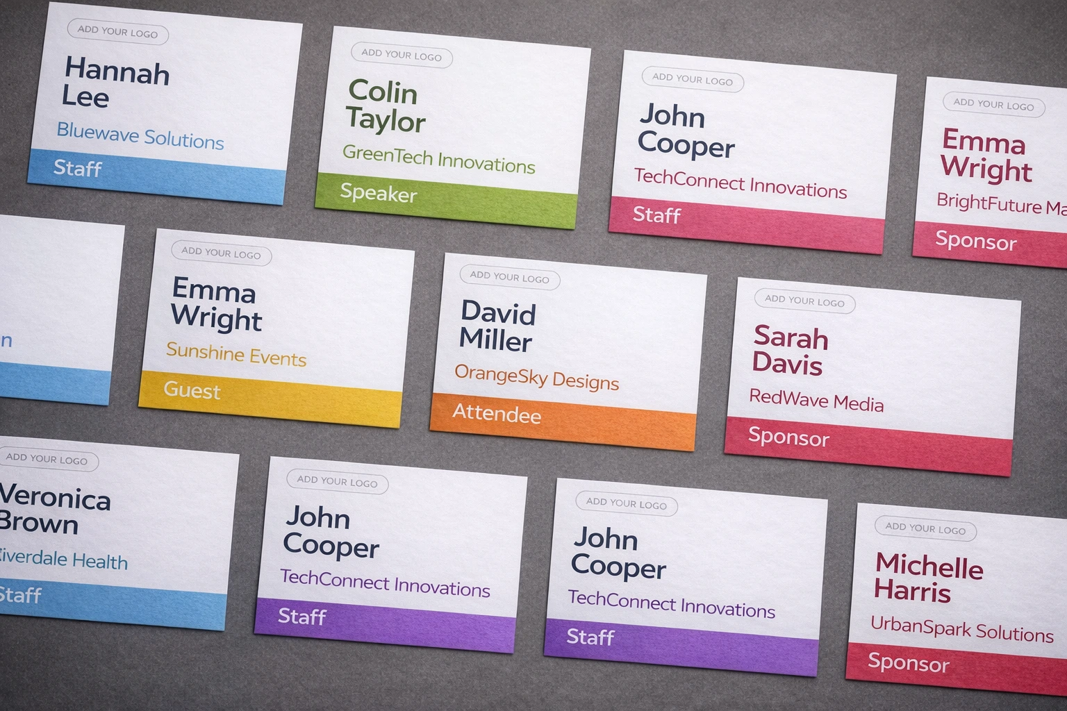
Start with one reusable badge layout, place the shared event or company logo in a consistent brand zone, and map each attendee's name, organization, title, and role from a spreadsheet. The attendee name should remain the most readable element; the logo supports recognition rather than competing with it.
Decide which logo the badge needs
| Logo type | How it varies | Recommended treatment |
|---|---|---|
| Event or organizer logo | Same on every badge | One consistent header, footer, corner, or side zone |
| Sponsor logo | Usually same across a batch or badge category | Separate sponsor zone that remains secondary to the name |
| Attendee's company logo | May differ for every attendee | Requires a verified variable-image workflow and reliable source assets |
BadgeFlow supports adding images and logos to badge designs. Before planning a different company logo for every attendee, confirm the current editor's attendee-specific image workflow. Do not assume that a text column containing a company name automatically supplies a usable logo.
Prepare the logo for printing
- Use the original asset. Avoid screenshots, social-media thumbnails, or images copied from a website.
- Prefer SVG where the editor and print workflow support it. Otherwise use a high-resolution PNG with transparency.
- Preserve the aspect ratio. Resize from a corner rather than stretching the logo.
- Keep clear space. Do not let names, borders, crop lines, or holder seams touch the mark.
- Prepare light and dark versions. A full-color logo may disappear against a similar background.
- Print a physical proof. Fine lines and small text inside a logo can fail even when the screen preview looks sharp.
Where should the logo go on a name badge?
Header
A header gives the event identity a predictable home and works well on portrait 4×6 or A6 credentials. Keep it shallow enough that the name still dominates.
Footer
A footer is useful when the main content needs uninterrupted space. It can also hold a sponsor lockup, provided the holder or lanyard does not obscure it.
Corner
A corner mark works for compact 4×3 or A7 badges. Use enough padding and avoid placing it near a clip, punch, or rounded holder edge.
Side band
A side band can combine branding and attendee-type color. Add a printed role label so the distinction remains clear without color.
Keep the information hierarchy clear
- Attendee name: the fastest element to recognize.
- Company or organization: the main networking context.
- Job title or role: useful supporting information.
- Badge type: Speaker, Staff, VIP, Exhibitor, or Attendee where needed.
- Logo and sponsor branding: visible, consistent, and secondary.
For exact font, spacing, safe-area, and long-name guidance, read how to design professional conference badges.
How to handle several logos without clutter
| Situation | Practical approach | Avoid |
|---|---|---|
| Organizer plus event logo | Use one approved lockup or give one clear priority | Two equally large marks in competing corners |
| Headline sponsor | Reserve a restrained sponsor zone | Making the sponsor larger than the attendee name |
| Several sponsors | Use a single approved logo strip or move the full list elsewhere | A dense wall of tiny unreadable logos |
| Exhibitor's company | Use the company name as text unless a variable-logo process is verified | Searching and inserting unapproved logos manually |
Create different names with one branded template
Store one attendee per spreadsheet row and use separate columns for the fields that appear on the badge. A practical file might contain:
first_name,last_name,company,job_title,badge_type,qr_valueImport the data, map each column to the correct element, and leave the shared logo in the master design. Test the longest names, missing job titles, and every attendee type. The complete process is covered in creating name badges from Excel. For internal programs, adapt the same system using the guide to branded company-event badges.
Create role variants without rebuilding the brand
Keep the logo position, typefaces, grid, and core colors fixed. Vary a role label, accent band, or operational field. A speaker badge might add a SPEAKER band; an exhibitor badge might add a booth number; a staff badge might use a stronger STAFF block. Browse the conference badge template system for role-specific layouts.
Test colors and logos on the actual printer
Office printers, thermal devices, color label printers, and professional presses reproduce logos differently. Fine lines can fill in, pale colors can disappear, dark backgrounds can consume ink or toner, and screen colors do not guarantee a print match.
- Print on the final paper or badge stock.
- Check both bright and typical venue lighting.
- Inspect small registered marks and sponsor text.
- Place the badge in its holder to reveal glare or hidden edges.
- Confirm that the stock is supported by the printer.
Use the badge paper and cardstock guide before loading unfamiliar media.
Create branded badges from your attendee list
Add your event logo once, map attendee fields, and generate consistent personalized PDFs.
Frequently asked questions
Which logo format is best for a printed name badge?
Use an original vector file such as SVG where supported. Otherwise use a high-resolution transparent PNG. Always test the actual print.
Where should a logo go on a conference badge?
A consistent header, footer, corner, or side band works well. Keep it away from holder seams and secondary to the attendee name.
Can every badge have a different name but the same logo?
Yes. Keep the logo in the master design and map each spreadsheet row to the attendee text fields.
Can attendees have different company logos?
Only when the chosen tool supports a verified variable-image workflow and you have approved, correctly matched assets. Otherwise use the company name as text.
How many sponsor logos should appear?
Use only the logos required by the sponsorship agreement and the available readable space. A single approved strip is usually cleaner than several independently placed marks.
Why does my logo look blurry when printed?
The source may be too small, compressed, or scaled beyond its resolution. Replace it with an original vector or higher-resolution asset.